Best of the Best Facebook Timeline + Pinterest
Like this Article?
Consider sharing it with your friends.
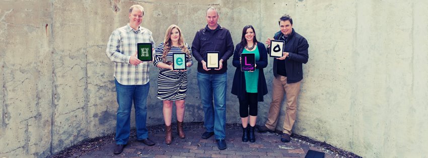
Class. Take a moment and look at some brand pages on Facebook. Who has done a great job on their Timeline? Then I want you to go look at some brand Pinterest pages, and see who has done the best. If you are so inpsired, share an example on the comments of this post of a brand that you feel does a great job. I am really curious to see what you come up with. BTW, have you tried the Timeline? Do you like it? The new Ingenex Digital Facebook timeline is a work in progress. Like our new photo?

Comments & Feedback
First off, I actually do really like your new timeline photo. I think it’s really fun and I love the coloring.
Since voluntarily switching to timeline a while back, I have to admit that I love it. I think it allows you to make your page a little bit more personal and professional all at the same time. I absolutely love it and couldn’t imagine it going back to how it was. The “old” Facebook was getting quite boring, and I think Facebook made a great decision to totally revamp.
As for whom I really think does a great job utilizing Facebook brand pages? I think Coca Cola does a great job upholding the branding of their product, and I think Bobbi Brown Cosmetics does a fabulous job listening to what their fans have to say and genuinely interacting with them. However, this involves integrating a variety of social media platforms as well as updating Facebook continually.
One of my favorite websites is College Humor. I follow them on every social media stite that I have along with following a couple of their writters and stars. I think they do a great job with their Facebook Timeline. They do soemthing which is really innovative they put their "milestones" as some of the videos that made them extremely popular. Some of these videos include the first ever "Jake and Amir", "Brohemian Rhapsody", and the Prank Wars that happened between Amir and Streeter. They also constantly update their page and get their fans to interact with them. The other day one of their employees came in with a hangover and ended up falling asleep under his desk, instead of just telling him to wake up they told their fans that if 1,000 people liked the picture of him sleeping then they would let him sleep. When they got all the likes in the first couple of minutes they then posted another picture of Rosie with a blanket and said if they get 8,000 likes on the picture they would move a statue right in front of his face so that when he woke up he would freak out. They are constantly having competitions to interact with their fans.
With the Facebook timeline, Facebook essentially gave brands a way to advertise themselves even more. The large image on the top of each brand's Facebook page is used to give the visitor an idea of what the company is all about, their persona, what they sell, etc. And each company does it in their own way. I immediately looked up Nike, Apple, and Microsoft's pages and they each have engaging images at the top of the pages, making it a mini-website for the brand.
As for Pinterest, it's a great place for companies to post images of new products, or images that link to important pages where they want people to visit. It's a great way to push customers to the company website and engage with the company in that way.
Both Facebook and Pinterest are great ways for companies to communicate with their customers and keep them up to date on what's new, as well as build and continue current relationships so people keep coming back for more.
There are so many great Facebook Timelines to choose from, but I really like the music artist Trevor Hall’s and Starbucks. Both of these brands have great top photos and are constantly updating their information. Trevor Hall keeps his fans updated on his latest adventures while also giving them links to new mp3s. He does a great job of making his fans like they are a part of his tours. Starbucks does a great job of giving daily deal information while also telling consumers what the brand is doing globally. I also came across Eduardo Calvo one day, a photographer from Ireland, who has a pretty creative timeline photo.
I haven’t used Pinterest yet, but I do like Mashable’s and West Elm Design’s Pinterest pages. These pages are very detailed and entertaining while also help consumers know what the brand is all about. I have always been a fan of Mashable, but here they have all their infographics in one area for easy access. West Elm Design has huge variety of their product shown in detail. After seeing these companies on Pinterest, I may be inclined to use it more often.
First off, I have not changed my Facebook to Timelime yet because don't know if I really like it yet. I probably just have to get used to it if I try it but i'm just not ready to change.
I "like" a lot of pages on Facebook and as I was going through them a couple stood out to me as being done really well. Kim Kardashian is a brand name in itself, love her or hate her she is not going anywhere soon. Kim (or her PR person) updates her Timeline a few times a day so there is always something new on there. She also posts from her blog and posts a lot of pictures. If you look at her Timeline she has 8.4 million "likes"... that is a lot of people! Her Timeline is also very organized and clear. I think Kim Kardashian has a great social media plan, not only in her Facebook Timeline but also in everything else she is involved it and how she ties them all together.
Not to sound repetative, but Etsy has one of the best Pinterest pages there is. They have everything you need from DIY projects and weddings to pets and gardening. Etsy targets to a lot of demographics and they have over 72,000 followers on Pinterest. I think Etsy has the perfect opportunity with Pinterest to get their views out to the world and to get more followers not only to their Pinterest but also their website.
& I like the new Timeline pic!
When it comes to Timeline, Tiffany and Co. seem to be on top of their stuff. Not only do they have over two million fans but they are consistently integrating their signature pale blue color throughout their page and engaging their fans. They allow for fans to upload pictures of their "true love" and direct them to another promotional website, WhatMakesTrueLove.com.
One of my favorite companies to browse on Pinterest is Etsy. They offer everything from recipes and clothing to decorating tips and jewelry. Because of their website layout, they have had tremendous luck with people pinning their merchandise. Beside each item they have a button to immediately pin it to one of your Pinterest boards.
Until recently I still was utilizing the old facebook layout. All of a sudden my layout was changed for my viewing and I was told that on April 9th it would be visible to the rest of Facebook. I can't say that I like the new layout. I miss having the old uncomplicated design. However, with time I am sure that I will get used to it.
Call me a kid, but I like how Nickelodeon is using Facebook. It's like a condensed magazine where all of the articles are no longer than your average facebook status. They announce new shows, results of the recent Kid's Choice Awards, and announce new games and polls from their website.
As for Pinterest, I think that Forever 21 has a great page. It shows inpriration behind their clothing styles. Its a pretty cool way to get customers involved in seeing the behind the scenes of fashion design,
I'm currently using Facebook Timeline. Persoanlly, I didn't think it was that big of a deal changing from the classic Facebook layout to Timeline. I like Timeline, but I have missed a few posts just because timeline is not as easy to keep up with as the classic facebook page.
For Facebook I think that Old Spice is doing a really great job at using Timeline. Their history is hilarious and fits well with their company voice and personality. They make very witty posts that are modeled after the speech of their commercial stars. I also really love their use of pictures and highlighting certain posts. Another part of Timeline they use well is the history feature. They have a (false) history of the company dating back to it's "origins" that continues the silly, witty banter. They also have a very dynamic cover photo and profile picture.
Someone I saw using pinterest well is was Southwest Airlines. They have several boards that include their fleet, plane crafts, vintage photos, destinations they fly to, inflight pictures, employees, quotes, tips for travel and a couple more. I thought all of these boards were very relevant to the company and they are really interesting and would certainly make me interact with them. They really have boards that would appeal to everyone and they all connect back to what the company is all about.
I think Nordstrom has an impressive Timeline page. Not everyone can boast that their fan page has over 1.3 million "likes," and this page certainly deserves recognition. On this page, I can see what friends of mine have posted about the department store, discover new trends, and see recent posts on the company.
While I am not typically a fan of Pinterest (I'm still trying to find out why everyone loves the site), Nordstrom also has a great Pinterest page. I think its pretty easy for retail stores to have a good presence on a site like Pinterest, where users are trying to find inspiration for new clothing, shoes and cosmetic trends from others that are using the site.
I really like Zara's facebook page, zara is known as highend, trendy and afforable clothing line for young people. the pictures on their timeline is very impressive, very strong image, usually white background and neat outfit with top ranked models, not just random teenagers like a lot other clothing brands(Nasty gal/ Asos...). and they promote their clothing line with Zara fashion magazine, which is one thing special about Zara facebook promotion. in general, Zara facebook page is neat, fashionable and the other social media promotion.
I had timeline for few months from now, and at first, I dont really like the complexity of timeline, facebook layout used to be so simple and easy to figure out the different settings. but after few weeks, new funtions from timeline really works well for facebook and brings facebook alive.
Starbucks does a really good job on their Facebook Timeline. They have posted their history all the way back to 1971 when their first store opened. And throughout the next thirty years, they list the most prominent happenings in their company that has led them to be who they are today. They post their current specials, community service projects as well as what their fans have posted, mentioning Starbucks.
Pottery Barn has really used Pinterest to their advantage. They post single product items such as pillows or candles, as well as a whole room setting with their furniture and room accessories to complete the look. They also have separate page category for their Pottery Barn Kids line.
I have tried the Timeline and do not mind the new look. I haven't taken much time to play around with all of the new features, but it sure has evolved from the first pages of Facebook.
I was required to do some research on some social marketing campaigns for another class and I focused my efforts on The Heart Truth. In doing so, I really liked their use of the Facebook Timeline. Their cover photo really gives an idea of what the organization is all about. Throughout their wall, they use a nice balance of informational posts, pictures, and event promotions. Another brand page I think does a great job is the Detroit Tigers Facebook. Their cover photo is a cool picture and they really keep up on updating their page.
I found that less companies and brands utilize Pinterest so far. Again, the Detroit Tigers Pinterest was one of the best I found. They have boards for their promotions, Tiger gear, and event photos. Another brand that is harnessing the power of Pinterest is Macy's. With 19 boards, they are using this site to engage their target audience.
I do have the Timeline. I am not a fan of it since the embarrassing posts and pictures of my younger years is just a click away. However, I do think that it is very useful for brands and compaines. It allows you to see their evolution and where they came from and where they are now.
I like Alpha Omicron Pi fraternity's Timeline because of their cover photo. AOII recently installed a new chapter, and they used their banner page to announce that instillation to their fans and followers. I thought it was a clever way to share this news without it getting lost in the organization's daily timeline posts.
One of my favorite Pinterest pages is the Lilly Pulitzer page. They post pictures of their prints and products, but the majority of their content is for users and created by users. They share Lilly-inspired crafts and projects made by people outside the company, things they love, and colorful places around the world. My favorite board is the Lilly Makes Me Feel... board, where they uploaded responses to a question they asked a few weeks ago. I thought it was a creative way to use Pinterest to interact with their customers and fans.
It took me a little time to get used to Timeline, but now that I have my page looking how I want it, I really like it. I think the banner gives people the freedom to be creative in branding themselves, and I like what Ingenex did with their photo. It's interesting to look at what companies put as their banner photos, and how creative photos can set certain companies apart from the rest.

Picture1 from “The Biggest Things”

Picture1 from “Funny Hats”
I really like the way Verizon has designed their timeline. Not that it's really any more special than other brands pictures and etc. But it uses customer produced images using their products. What a great way to promote their business, their products, and keep up customer interaction. They've done an awesome job on Facebook. On pinterest they're slightly boring. I prefer Biggby. They do an awesome job of not just focusing on their product, so it's not boring, and posting about related topics. It's very fun and interesting. I like Ingenex's picture by the way! Super cute :)
- « first
- ‹ previous
- 1
- 2
- 3
- 4


 MSU New Media Drivers License Copyright 2017
I switched over to timeline about a month ago now, and I have to admit I really like it. A lot of poeple seem to be hesitant for some reason, but I find that timeline gives you a lot of flexibility when customizing your page. It makes it really simple to go back in time on someone's profile, and I think that's an aspect that brands should take advantage of.
The Ingenex Digital cover photo is super creative and fun to look at. The cover photo option is something I really like about timeline. It gives you the option to express yourself on a larger scale, and it's a great tool for brands to showcase their logo, creativity, or just showcase an overall theme for their Facebook page.
Some of the brands I think stand out on Facebook with their use of timeline are NikeID and the official Detroit Red Wings pages. Nike does a great job using the timeline cover photo to showcase some of their product. The Red Wings interact with their fans a lot on Facebook and their Pinterest page has a lot of different albums, including pictures of the players around the Joe, fan art, Red Wings in the community, and the Wings presence in pop culture.